Introduction
A solid grip on the spatial component is absolutely critical to any humanitarian operation. I'm not talking about abstract jargon like "humanitarian space"—I mean the gritty specificity of knowing exactly where needs are, and where our teams can actually stand on the ground.
Yet, for a tool this critical, the specialized agencies tasked with producing these information management lifelines don't always get it right.
Humanitarian mapping is often too symbolic and too small-scale to be fit for purpose. It is mass-produced to be consumed from comfortable country-level offices.
No wonder the first thing any new Field Coordinator asks when arriving at a staging area is, "Can we make a mapping of presence, guys?" The anxiety of planning a mission for a location where needs are already miraculously met (or entirely absent) is very real. The 5W (Who does What, Where, When, and for Whom) was supposed to fill this gap, but the basic information—with correct and functional administrative boundaries—is rarely provided. Strangely, this is incredibly difficult for senior country teams to understand.
An oversimplified map can declare an entire city a "no-go zone," blindly cutting off aid to thousands, while a map that's overly complex can paralyze decision-making with unnecessary noise.
This guide walks you through the hierarchy of mapping. We will explore each level, defining its purpose, audience, and stark limitations. By understanding the difference between a simple sketch and a live geo-server, you'll stop using a hammer when you need a scalpel.
Level 1: The Quick Sketch (Situational Awareness)
- The Tool: Drawing software (PowerPoint, Paint, Google My Maps) or simply a pen and paper.
- The Goal: Immediate communication.
These are single-use, disposable tools meant to communicate one very specific thing: recent attacks for a donor's visit, a localized office pin, or an emergency hospital route.
This is primarily to show security personnel or VIPs a snapshot of the reality; it proves your situational awareness. They don't need academic analysis—they need an image that will likely get buried and lost in their inbox immediately after they glance at it. Do not spend more than 20 minutes on this.
Level 2: Simple Visualization (The Storyteller)
- The Tool: Desktop GIS export, Canva, Illustrator.
- The Goal: Strategic direction.
These are high-scale maps covering vast areas with an extremely low level of detail. Their sheer purpose is to tell a story, serving senior management to gain a vague localization awareness. These are the most abundant in the sector.
This is the typical symbology map. It is useful for a generic planning session at the country office (maybe once a year), and it looks beautiful hanging on the wall to make you feel like a military general strategizing.
In the humanitarian sector, we tend to get fatally stuck in this category, crippling our operational capacities down the line. For a technical coordinator trying to write a shiny proposal, this level is entirely sufficient. They only need to tell the donor: "I want to go here because of the humanitarian situation, but don't worry, I'll figure out the exact locations in the final report."
Level 3: Business Intelligence (The Dashboard)
- The Tool: Power BI, Tableau, ActivityInfo, Metabase.
- The Goal: Monitoring and inter-regional analysis.
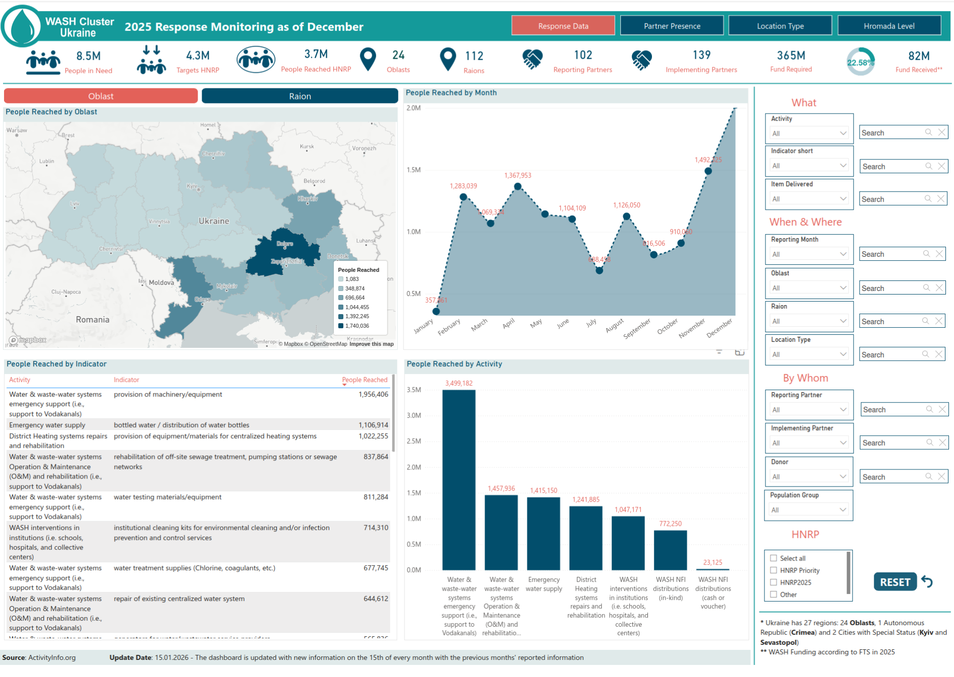
Dashboards represent the next tier of understanding, usually fueled by data collection tools like KoboToolbox and ActivityInfo. This represents a monumental qualitative jump. Before these tools, mountains of data went under-analyzed, and organizations were completely at the mercy of the specific skillset of whoever happened to be the Information Manager that day—ranging from brilliant data scientists to basic Excel users.
The Limitation: Dashboards shine at middle scales. However, the exact moment you try to force granular, local-level data into them, the sheer volume of information bottlenecks and crashes the software. They simply are not built for microscopic operational tracking. This is a classic example of the humanitarian tech trope: "Keep using it until it breaks."
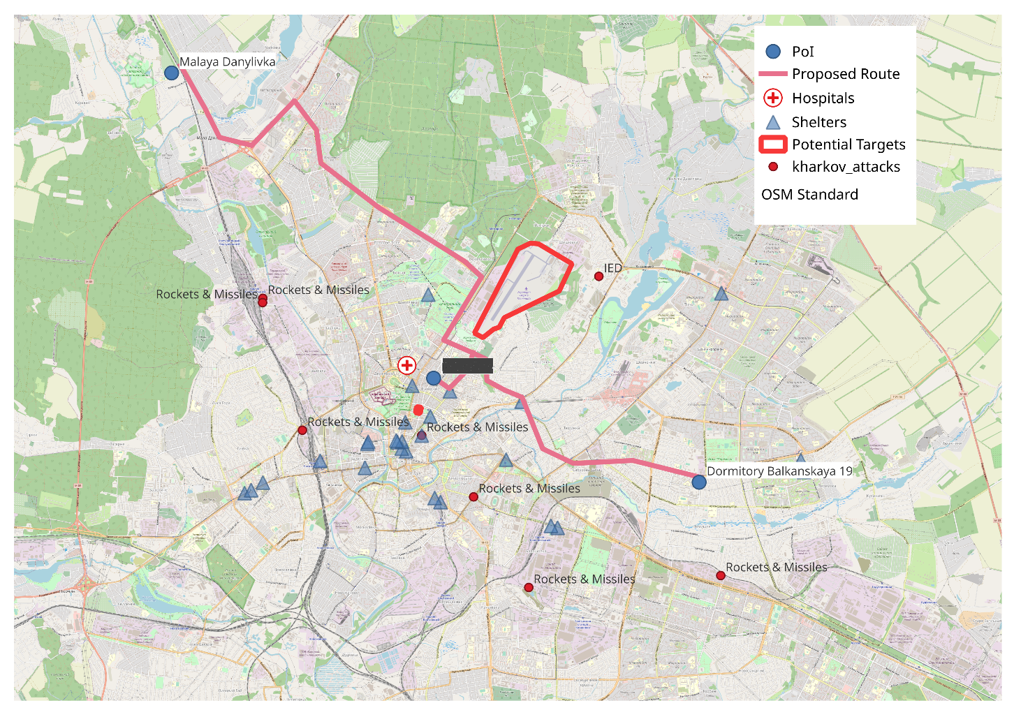
Level 4: Web Map Services (The Operational Engine)
- The Tool: GeoServer, OGC Standards (WMS/WFS).
- The Goal: Granular, local queries and field coordination.
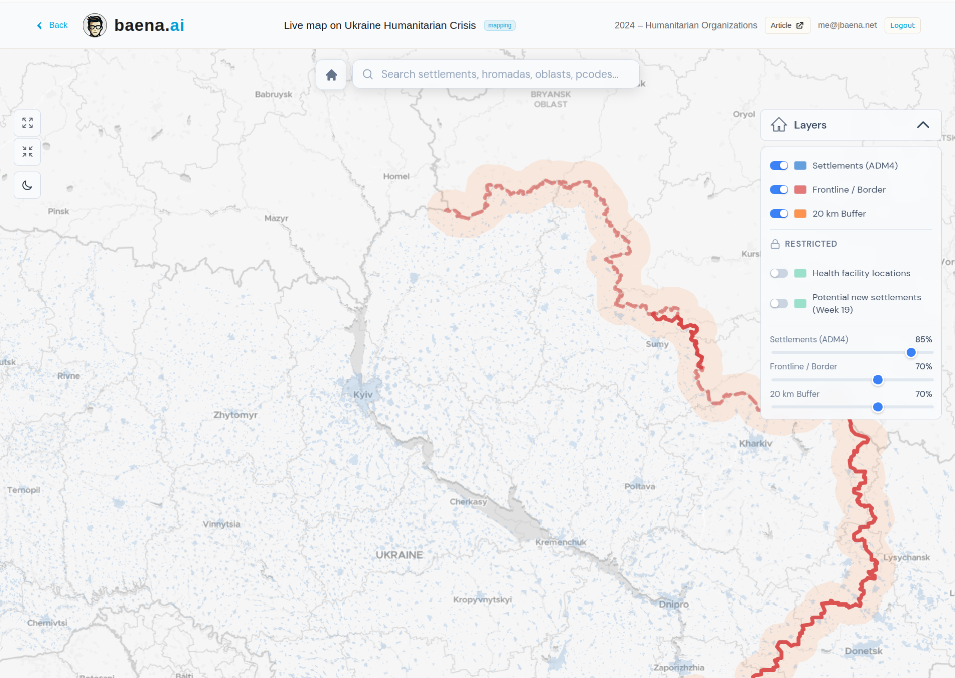
These servers handle the absolute granular bedrock of information. If well-configured, they are exactly as good as the detail of the raw information uploaded to them. These are the tools a Field Coordinator actually needs to decide exactly where to operate.
Because they are perceived as technical, difficult to set up, and because senior management doesn't strictly need them to look good for advocacy, they are consistently overlooked or deemed "too expensive." The truth? Modern open-source backends like GeoServer have completely solved the cost and complexity issues. We just need to implement them.
I deployed a live example of this at ua-maps.baena.ai. In this service, every single settlement is interactive—clicking on one instantly displays some operational data, such as its exact distance to the frontline. To ensure the context is always reliable, the frontline position and its corresponding buffer zones are automatically recalculated daily. Nevertheless, be mindful when using this service, exact locations are not always updated timely for operational porpuses.
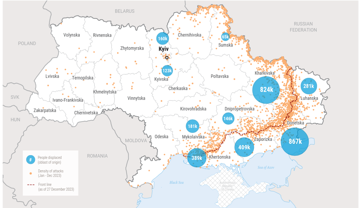
The Power of Scale: The Nikopol Example
Understanding the operational difference between Level 2 (Strategic/Small Scale) and Level 4 (Operational/Granular) isn't an academic debate—it actively saves or ruins lives.
Take the city of Nikopol, which sits under constant artillery threat due to its proximity to Zaporizhzhia Nuclear Power Plant.
The Strategic View (Level 2)
On a large-scale map, the whole municipality is painted red to indicate extreme danger. Consequently, it simply falls off the humanitarian planning radar for many agencies because it is lazily deemed "too complicated to access."
The Operational View (Level 4)
A closer look via a granular Web Map Service reveals an entirely different reality. It shows that artillery attacks are heavily concentrated in a narrow strip right along the river coast. The rest of the city remains practically untouched, with an attack ratio no higher than randomly safer cities in the East.
The Result: By using the wrong scale, we blindly cut off aid to a population. By using the right scale, we pinpoint safe zones for distributions.
Level 5: Full GIS & Geoprocessing (The Analyst)
- The Tool: QGIS, ArcGIS, Python/R.
- The Goal: Asking complex questions.
If you need to strictly query your data spatially, you have to lean on raw geoprocessing capabilities. For example: "Exactly how many settlements are within a 20 km distance from the Frontline where combat activity is demonstrably low?"
You need a full GIS suite to run this complex analysis locally and generate reports on it. This level also includes replicable data pipelines mapping using statistical software (like Python or R), providing the literal foundation for long-term policies and cementing the institutional memory of an operation.
Conclusion: The Future is Area-Based
The humanitarian sector desperately needs to force itself up this mapping pyramid. While simple sketch maps have their place, relying exclusively on them deeply hurts our accountability.
The paradigm shift toward Area-Based Coordination (ABC) will eventually drive this necessary evolution. ABC inherently demands much more refined, generalized, and local data rather than high-level, useless aggregates. This creates the exact feedback loop we need to aggressively promote: better local data enables intelligent field coordination, and superior coordination immediately reveals the gaping need for far more nuanced information systems.
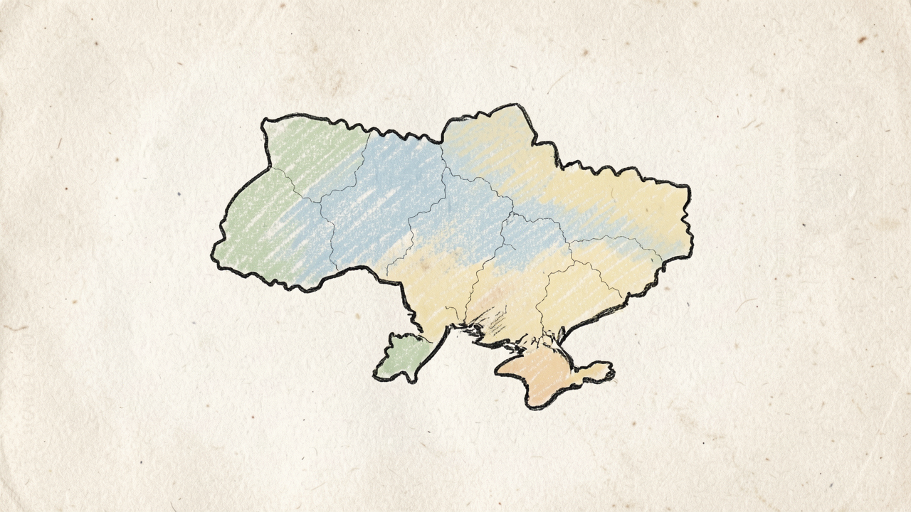
Bonus: The Foundation
There is actually a "Level 0" beneath the pyramid: Draw your own maps.
It is a genuinely relaxing experience. When I am trapped in a slow, painfully bureaucratic peace meeting, I color my sketches. Your brain gets infused with the local names, cross-references, and geographical features, quietly building a deeply intuitive understanding of the terrain that software alone can simply never replace.
Do you need a granular, scale-appropriate mapping solution for your field operations? Let's build something that works.
